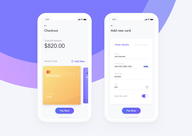
The best mobile app design is the one that goes unnoticed. It is the UX quality that makes a good product different from a bad one. Moreover, you have to be a good professional to create an interface with which people will be pleased to interact.
There is no universal formula for describing a perfect mobile app interface design. However, understanding the basic mistakes allows you to avoid problems in the future and create a truly successful product.
I have compiled a list of the most common mistakes in UX design for mobile apps. You should definitely avoid them if you want your users to be satisfied.
Poor Logic and Architecture
One cannot build a good house without a detailed plan and drawings. Likewise, one cannot develop a good mobile app without elaborate architecture, a precise hierarchy, and clear logic.
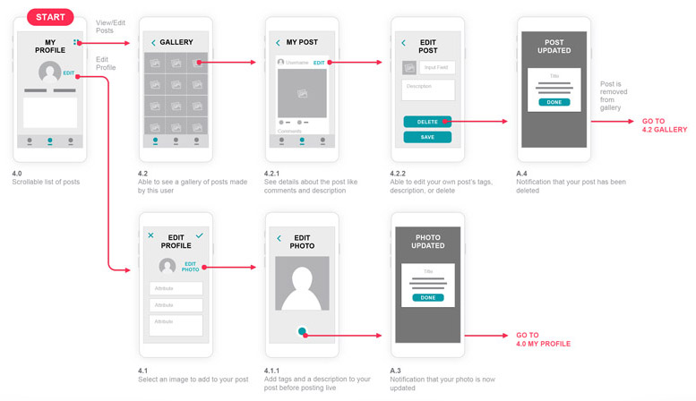
Ignoring this stage, you will not eventually be able to properly prioritize the interface elements and provide the user with convenient, easy interaction with the product.
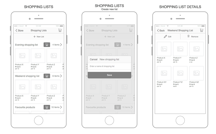
It is necessary to think over the logic of user interaction with apps and usage scenarios in advance; in fact, this can be done as early as the layout creation stage.
Want to start a project?
Our team is ready to implement your ideas. Contact us now to discuss your roadmap!
No Onboarding
When users first launch your app, they should immediately understand its value and advantages. Good onboarding solves this problem and it can also be used as a short tutorial with key tips.
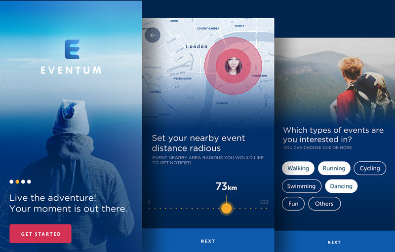
[by Shaun]
We have an article on our blog in which we considered the detailed examples and best practices of creating onboarding for mobile apps. We recommend that you read it if you want to learn more on this topic.
Overloaded Interface
Excessive content and interface elements cause the user to experience cognitive overload. Modern smartphones with large screens allow us to display much information, but we advise you to avoid this trap of freedom.
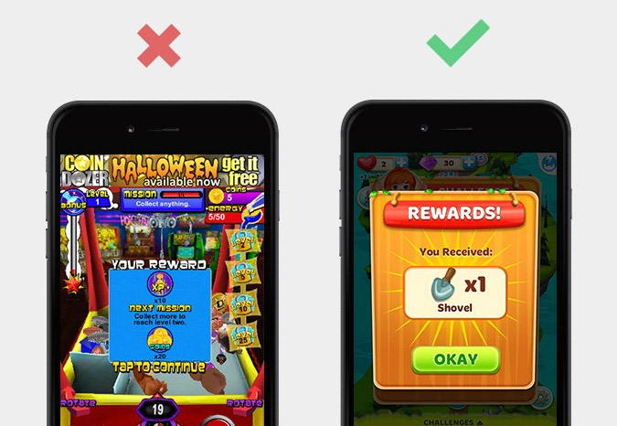
If you display too much content, users can be at a loss and can be easily confused when trying to make out what to click and do next. Your app should display only what is important for the user at the very moment.
Non-Standard Icons and Buttons
There are a number of elements that look the same in any interface. For example, the recycle bin and social network icons. This feature makes the design clearer and allows the users to clearly understand what to expect when they click the buttons.
It is not worth making them non-standard, as this can really confuse users. Ingenuity for the sake of ingenuity only is a poor practice.
Font Issues
You may think this issue belongs exclusively to the UI category, but actually, it does not. Typography is an important aspect for UX and can directly affect app user experience. Even if you come out with a generally pleasant and convenient interface but the text is difficult to read, it will cause negative impressions.
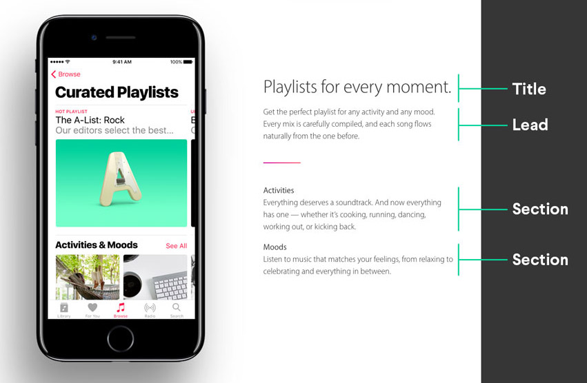
The most common mistakes of this kind are as follows:
- Too many different fonts (three or more) are used;
- Fonts are too small or too large;
- Poor contrast between the text and background;
- Non-standard fonts complicating text perception;
- Tricky Navigation.
When a designer tries to “reinvent the wheel” while working on an interface, for example, to create an intricate menu and to demand complex gestures from users, it only leads to problems. If users do not immediately understand how to find what they need, it is definitely a problem.
Never think that someone will spend a few minutes to make sense of the complicated navigation that you “rethought”. Users would rather delete an app and download something else than spend their time on it.
People download an app because they want to solve some problem by using it. So, you have to make sure they will not have to spend time researching the features of your navigation and make extra clicks.
Want to start a project?
Our team is ready to implement your ideas. Contact us now to discuss your roadmap!
Missing Calls to Action
In addition to the previous paragraph, it is worth remembering calls to action. Designers and developers tend to hide them, replacing them with gestures to make the app screen look nicer. However, it is a mistake.

Buttons, arrows, menu items, and other CTA elements are important interface components that directly impact conversion. Without those elements, users may fail to understand what step should be taken next and what to expect from further interaction with the app.
Reckless Copying and Chasing Trends
Things that work well for one of your competitors will not necessarily result in the same return for you. If you get deeply immersed, you can easily cross the line between inspiration and plagiarism. However, it would be a very good idea to take separate elements and remake them as you see them fit.
The same is true with trends. Just because something is new, it does not necessarily mean that it is good. Popular product developers remain quite conservative for a reason when it comes to changing UI/UX. A good interface does not necessarily have to be innovative. It should be convenient in the first place.
Let us sum up
Even in 2019, you can still find many mobile apps with interfaces that can hardly be called good. It is not surprising that users uninstall them from their smartphones soon after installation.
In a world dominated by mobile devices, user experience becomes more important than ever. Consequently, it is best to avoid mistakes rather than waste time and other resources to correct them.
Take the tips mentioned above into account when designing the UX for your future mobile app, and its chances of success will rise substantially!
UI/UX Designer at Lvivity. I'm responsible for the design side of things in our agency.
Our services